Feeds:
Posts
Comments

Archive for the ‘Colour’ Category

We have a Color Guru, or, as I have dubbed her, The Queen of Color, in our midst.  And her name is Jane Hall.

She considers herself to be a Lifestyle Designer. I think that’s a good title as well.  And we both agree that the power of color is overwhelming at times.  Jane has experienced this first hand, when people come through her doors and gasp or sigh or even tear up from the cornucopia of color in her shop.

If you’re feeling down and need a pick me up, forget the spa and get a hit of color/retail therapy all-in-one at Jane Hall.

Jane is a color “expert” in every sense of the word. Starting over 35 years ago making hand painted Batik clothing at the craft shows, she then followed a career as a fine artist.  She followed that with winning the prestigious Cadillac Fairview ARC Award  (Achievement in new Retail Concepts) for her work with Pittsburg Paints.  Her focus has always been what color can do for a product and ultimately the consumer.

With a background in Anthropology, Jane is fascinated by politics and culture.  In many ways this gives her an edge by understanding what her clients want and need to create the most fulfilling environment.  Instead of asking her clients, what color do you like or what will you be doing in this room, she asks, “ How do you want this room to feel?”

Featured on numerous design shows, magazines, newspaper articles, blogs etc. Jane is an icon in the Canadian design world.  And we’re lucky to have her in the Beach neighbourhood.

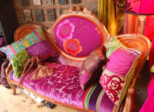
Jane Hall is art, bedding, cushions, drapery, furniture and lighting.  She will help you create amazing rooms and take your old antique pieces and turn them into a “pastiche” of color.

Here are some of my faves:

Check out Jane Hall here and then go down there and get your hit of color.

Cheers!

Read Full Post »

Happy Monday!

According to the experts at Pantone, some of the color trends for 2012 will be more dramatic and vibrant than we’ve seen in a long time. We’re heading into a world of color. Yeah!  And I can’t tell you how happy this makes me.

If you’ll remember, the color of the year was Honeysuckle Rose.

According to Pantone, Honesuckle Rose will continue to appear in most colour stories throughout the Fall of 2011 and into 2012. And one of the color stories caught my attention more than the others.  “Back to the Fuschia”, includes hot pinks, purples, reds, orange and jewel tone peridot as a contrast.

Here are some inspiring pictures to get your imagination going:

Betsy Johnson’s NY loft

Stay tuned in as I reveal the only place in Toronto to get your color fix!

Cheers!

Images courtesy of Google images.

Read Full Post »

Since last week I’ve been on a spring clean like no other.  I’ve made copious lists- Front Yard, Back Yard, Inside Paint touch-ups, Replenish List. I’ve decided, no matter how well you maintain your home you will need about $1000 minimum in upkeep every year.   That doesn’t include redoing your garden or replenishing your tools or towels or bedding. Here’s where I stop.

I’ve been in a kind of “Limbo” state or “Purgatory” as I call it and I’ve been wanting to redecorate my bedroom but don’t want to make the investment in a boring bedding set. Considering we spend 1/3 of our lives in our beds, it should be a place of serenity and beauty.  I want freshness, colour, and garden.  And frankly I can’t seem to find the colours I want without doing custom, which I could easily do if I weren’t in Purgatory.  See what I mean.  No?

Well, it doesn’t really matter because I finally found a bedding set that I love love love!  And it was at the One of a Kind show this past weekend.

I saw it, like a beacon amidst the crowds –  Colour !!

Maria Pezzano, an artist from Guelph, Ontario has partnered with Guildcraft, makers of high quality pillows and duvets, to bring you gorgeous one-of-kind prints.  Maria takes her large-scale garden art and reproduces it to be transferred onto excellent quality organic cotton sateen.  The bed at the show was so comfy I wanted to just lie there all day.

Maria’s stunning designs can be custom ordered by contacting her directly.  She will come over, help you decide which set will work with your décor, take measurements and have it made just as you like it. Now that’s great service!

Contact Maria and see her complete spring line.

Cheers!


Read Full Post »


Tigers Nest Monastery

Last week, I was talking with my friend, Fiona, who was about to embark on a vacation that she had been planning for months.

Destination – Bhutan

I had forgotten about Bhutan, until intrigue got me researching.  And then I remembered.  Many years ago, I saw a documentary on a land far away that was considered to be the last Shangri La on earth; where the government was more concerned with the “Gross National Happiness” than the “Gross National Product”; where the people were always laughing and enjoying life.  “Where on earth is this place? I must go there”, I said to myself.  Its name was Bhutan.

Bhutan is a country surrounded by China to the north and India to the south, Tibet as a close neighbour, still has a king and is the land of the “Thunder Dragon”; A land of colour and vibrant living.

An avid photographer, Fiona will be reporting on her trips to some of the weaving mills, but in the meantime, I thought I’d get your colour juices going this morning with a colour study of the coronation of the recent Dragon King in 2008.

Happy Happy Monday!!!

Cheers!

Read Full Post »

My favourite colour is red.  I love the way red makes me feel when I wear it.  I literally feel like moving faster and getting more done.  Bizarre, I know.

But that’s the power of colour.

In feng shui, the colour red represents the south, fire, summer, eyes and heart.  It also has associations with being clingy and dependent, weapons, drought, brightness, beauty, helmets, spears and swords and dryness. We already know that red is passion; think red lips.  Red is action and intensity; think bullfighting.  It can represent anger, as in a red face.  It is used to alert, and draw attention to, like a stop sign.  It means to go fast, like Ferrari red.

We use the phrase “red hot” to describe something that is extremely hot and just the words alone make you feel the pain of the “red hot” poker!  Is there any wonder Mother Nature made peppers red ).  And my favourite candy as a child; red Hot Tamales.

How important is the colour red in our everyday life?  Well, think about the red flashing light on a police cruiser and why fire engines are red?   Would we remember to grab the fire extinguisher if it were yellow? Probably not. Try wearing a red scarf to an interview and I’ll bet the interviewer will remember you, over all the others!

Painting your bedroom red will help with the passion but will not help you relax and have a good night’s sleep.  Unless you use it strategically to create interest, such as in your lingerie!

Create an exciting dining room by painting the walls red and see how much the conversation increases next time your dining.  Or make a stagnant corner come to life with red flowers or a red sculpture.  If your front door faces the south, paint it red.  That’s good feng shui.

And don’t forget that red is the colour of love…Happy Valentine’s Day!

Read Full Post »

Blue Monday

So today is supposed to be “Blue” Monday.  According to the so-called experts, this is the day we’re supposed to be really sad about not being able to pay our bills from Christmas and that it’s so cold (it’s -21c here in Toronto) and dark outside.  Well, I say pooh! to that and after I down all my happy vitamins with my Chai Latte from my favourite yellow mug, I’m going to put on my favourite music, crank up the heat and turn on all the lights in my house.  That should ward off the blues!

But wait, I love the colour blue!  And, frankly it’s gotten a bad wrap being associated with being sad. Hmmm, but I didn’t see any blue gowns at the Golden Globes last night. Could it be going out of style?  Surely not.

Blue has always been for me a reflection of calm and groundedness because it reminds me of the sky and water that I love so much.  I realized as I spent the week thinking about and seeking out the colour blue, that I really don’t have a lot of blue in my home.  In fact the only items are paintings and in my wardrobe are my well co-ordinate yoga ensemble and yoga mat.  That’s it.  And I noticed many food items were labeled in blue.  Blue was not very prevalent in foodstuffs a few years ago.  But as soon as they introduced the blue Smartie, it seemed that blue became an acceptable colour to consume.

Blue reminds me of the summer when I was 12.  My family spent a month on the Adriatic.  I remember going to summer camp on a small island where we spent every afternoon swimming and playing in the Adriatic ocean.  Deep Azure blue was the colour of the water.  The brave young boys would hold competitions as to who could jump from the highest cliff. Ah, the memories.  But I digress!

Blue is healing, clean, clear, nourishing, pure, ice, sky, royalty, boys, cold, calm, magic.  It is used to express how we feel; “I feel blue”.  And if you are lucky enough to see a “Blue Moon”, folklore says the moon will talk to those in it’s light. Long considered a corporate color, blue, especially darker blue, is associated with intelligence, stability, unity, and conservatism. In Iran, blue is the color of mourning while in the West the something blue bridal tradition represents love.

In Feng Shui, blue is placed in the north sector and represents water. It is good ch’i if you can locate all your water rooms in the north.  That is, the washroom, laundry, kitchen etc.  But be cautious and always close the toilet lid and door to the bathroom because it’s believed that good ch’i also gets flushed down the toilet!

Where is the toilet located in your house? If it’s not in the north, do you have water problems, leaks etc? If you have a child who doesn’t sleep well, try painting their room blue and see what happens.  I did and now my son is much calmer going to bed at night and does sleep more soundly.

Ah, enjoy the beautiful blue sky today where ever you are.

Cheers!

Read Full Post »

In this week of reassessment and reflection, I think about my clients over the years and put them into two categories:

  • Colour Lovers – People who pick colours based on their emotional responses and who aren’t afraid to use colour whenever they can.
  • Colour Hesitants – People who are afraid to make the wrong choices with colour and therefore stick to the neutrals and rarely change their colours.

Although there are alot of Colour Hesitants in Toronto, I believe this is changing and people are becoming more courageous. Hurrah!

If you are a Colour Hesitant and want to become a Colour Lover in the new year, take these first steps:

1. Look at the colour themes for 2011 below. Take your time and look at each one carefully. Pick the theme that you absolutely love – that you say, “Ooh! I like that one.”

2. You have my permission to pull the picture from the site and print out only the theme that you love.

3. Hang it on your fridge, wall, on your closet, wherever, so that you can see it in your environment.  You will be able to see which colours you can pick out as accents (usually the more vibrant ones).

4. Slowly incorporate that colour into your decor by purchasing throw pillows, hand towels, bedding, vases etc. Be courageous!

5. If and when you are comfortable with this or these new colours, take the next big step and repaint.  For example, take the accent colour and paint your headboard wall.  Or go for it and do the whole room.

6.  From this point on you can take that printed colour theme whenever you shop for home decor items and use it as a guide to pick colours that work with your theme.

Congratulations, you are now a Colour Lover!

Cheers!

Read Full Post »

Here it is folks!

The colour we’ve been waiting for.  As dubbed by the experts at Pantone – Honeysuckle is the colour of year for 2011

“A Vibrant, Energetic Hue”

“A Color for All Seasons. Courageous. Confident. Vital. A brave new color, for a brave new world. Let the bold spirit of Honeysuckle infuse you, lift you and carry you through the year. It’s a color for every day – with nothing “everyday” about it.”

I have only one t-shirt that’s pink and that’s only because I liked the saying on it “Well Behaved Women, Rarely Make History” Laurel Thatcher Urlich.   And you can guess that nowhere in my decor will you see a pinkish hue.  But I totally love Honeysuckle and that’s because it has a bit of an edginess for a pink.  Don’t you think?

And I won’t hesitate to use it my work.  I can see it paired with grey and silver for a masculin look or with greens and blues for a youthful, fun look.  Ohh… so yummy that would be.

It’s a colour that allows you to have fun.  Here’s to a fun year for 2011!

Cheers!

Read Full Post »

Colour – Yi House

Here in North America, we know China to be a country that provides us with cheaply made consumer goods, as well as a country bent on economic domination of the world.  If it’s not China, it’s India or the US. Whatever.

Of course, China has a rich culture, but did you know that it’s also making strides to join the world arena when it comes to boutique hotels.  Shauna Liu, founder of one of the first boutique hotels in Beijing says, “I want this to be a place for people who love art”.

Yi House, named for the Chinese character Yi, which sound has two characters meaning “without equal” and “guest house” in ancient times.  It is a 30-room luxury boutique hotel in the heart of 798, the modern art district in Beijing.   The building it occupies was a crystal factory in the last century.

The Rooms were designed by Liu herself.  Look at the gorgeous way she combined colours and textures:

If you travel to Beijing on business, stay at Yi House and let me know how it was.

Cheers!

Read Full Post »

If you’ve been thinking of Christmas decorating (I know that the US hasn’t had Thanksgiving yet, but here in Canada the stores are full of Christmas stuff already!) and need a fresh take on your colour scheme, like I do, think white.

Although traditionally, when you think white walls you think modern design.  But it doesn’t have to be that way when decorating for the season.  Think slipcovers, tablecloths, throws, pillows and accessories.  These are the items that you can change very simply to create a new fresh take on your Christmas Styling.

Here are some pictures for inspiration.

Cheers!

Pics from House and Home.

Read Full Post »

Older Posts »